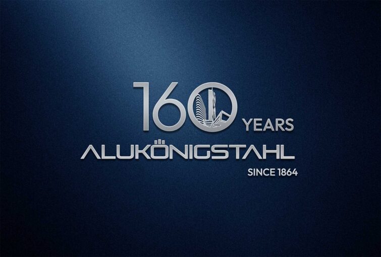
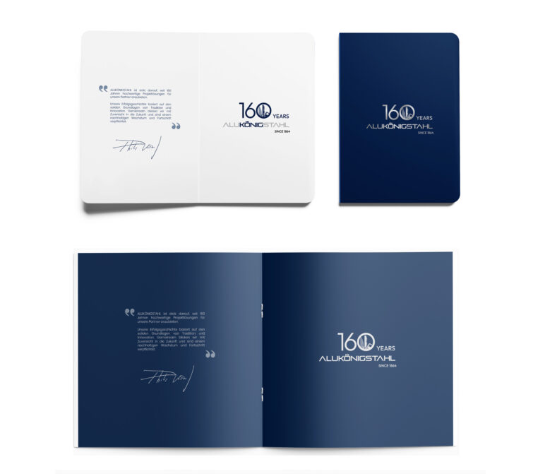
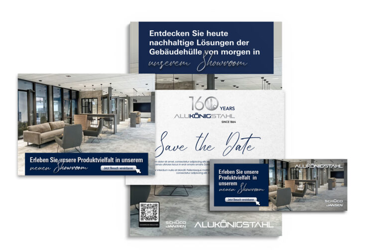
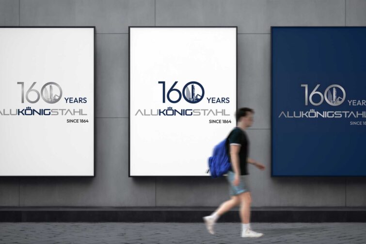
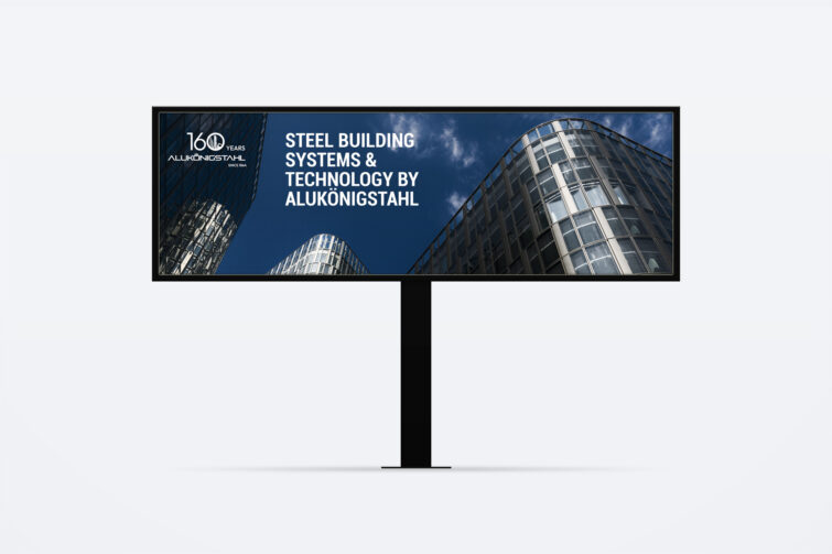
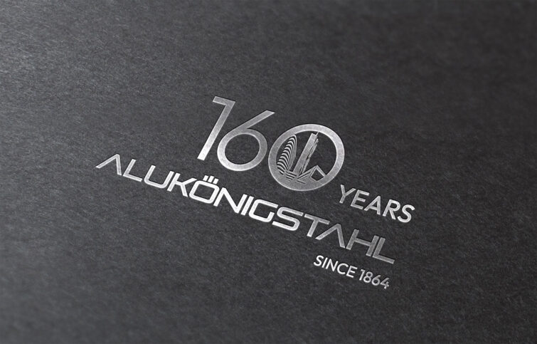
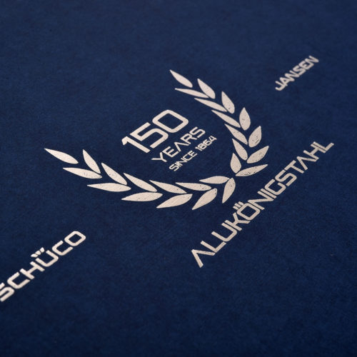
The logo for ALUKÖNIGSTAHL’s 160-year jubilee combines tradition and innovation to honor the company’s long history and forward-thinking vision.
Typography: A bold, modern font for the “ALUKÖNIGSTAHL” name, symbolizing strength and reliability. The “160 Years” text is highlighted in a complementary, elegant serif tipography to evoke a sense of celebration and heritage.
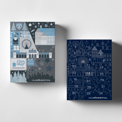
Color Palette: The logo features the company’s signature colors—deep blue and metallic silver—symbolizing trust, professionalism, and durability.
Accents of silver are added to emphasize the prestige of the anniversary.
Graphic Elements: A dynamic ALUKÖNIGSTAHL reference building motif is incorporated into the text to create a sense of continuity and progress.
The “160” is designed to stand out.
Anniversary Mark: A tagline like “160 Years of Excellence” is placed beneath the logo to reinforce the celebratory theme.
This design effectively communicates ALUKÖNIGSTAHL’s legacy, commitment to quality, and vision for the future while standing out as a memorable centerpiece for the jubilee celebration.
