LFP Montage Branding – Logo Design
We had the pleasure of designing the logo for LFP Montage, a company specializing in construction and assembly.
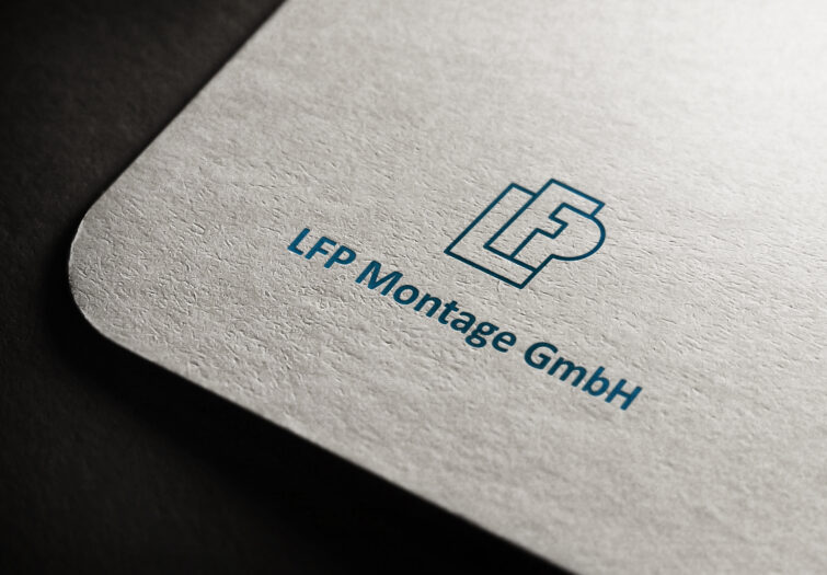
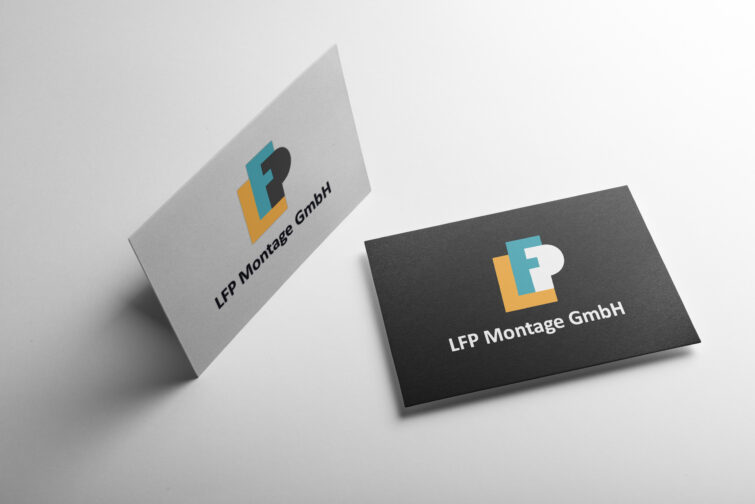
The logo reflects a bold and structured design, perfectly aligned with the company’s expertise. The letters “L”, “F”, and “P” are skillfully interwoven into a cohesive form, symbolizing the strong foundation and seamless collaboration that define the company’s approach to building projects.
This integration of the letters conveys stability, reliability, and unity—key values in the construction industry. The clean and modern typography emphasizes technical expertise, while the balanced arrangement highlights the company’s commitment to quality and precision.
The chosen color palette enhances the brand’s identity, reflecting trustworthiness and a forward-thinking outlook.
We are proud to have created a visual identity that effectively communicates LFP Montage’s mission to build lasting structures and establish a strong presence in the industry.
